Czech Innovation Expo – catalogue
MB Book – Retrospective
About the project
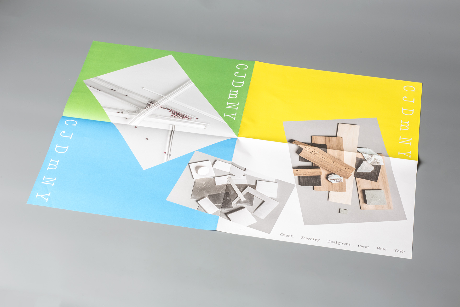
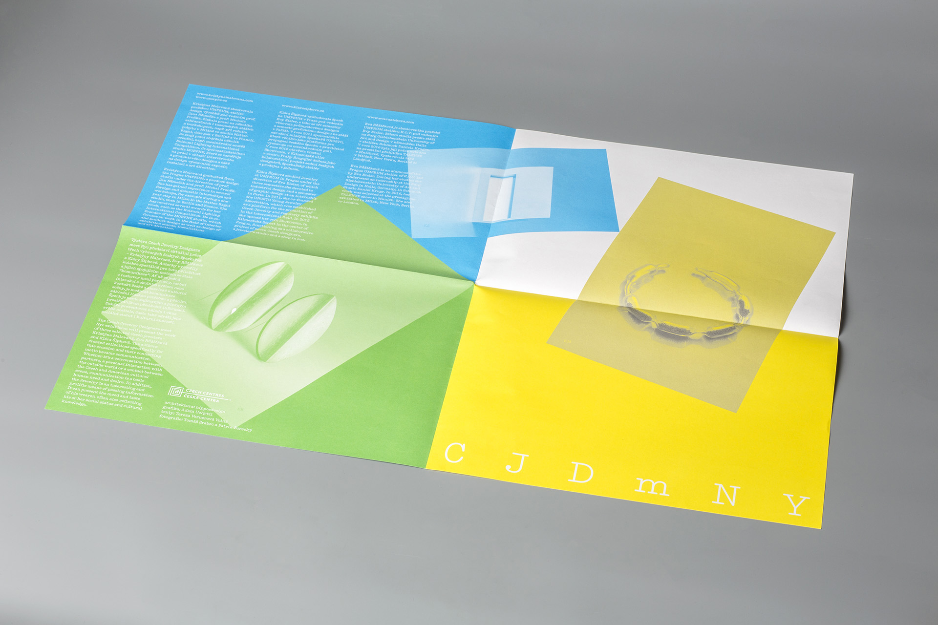
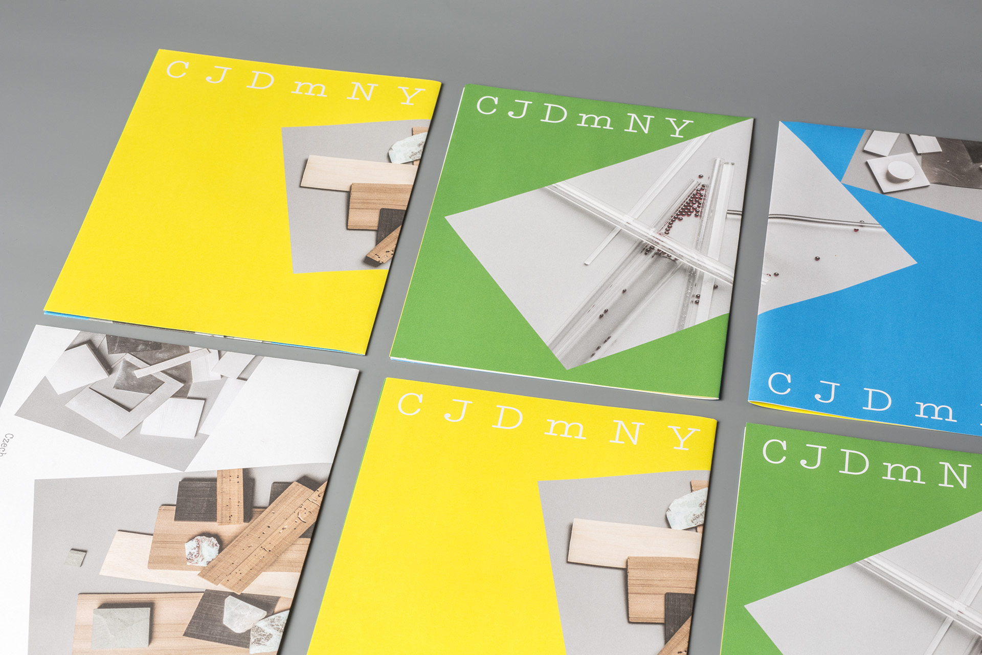
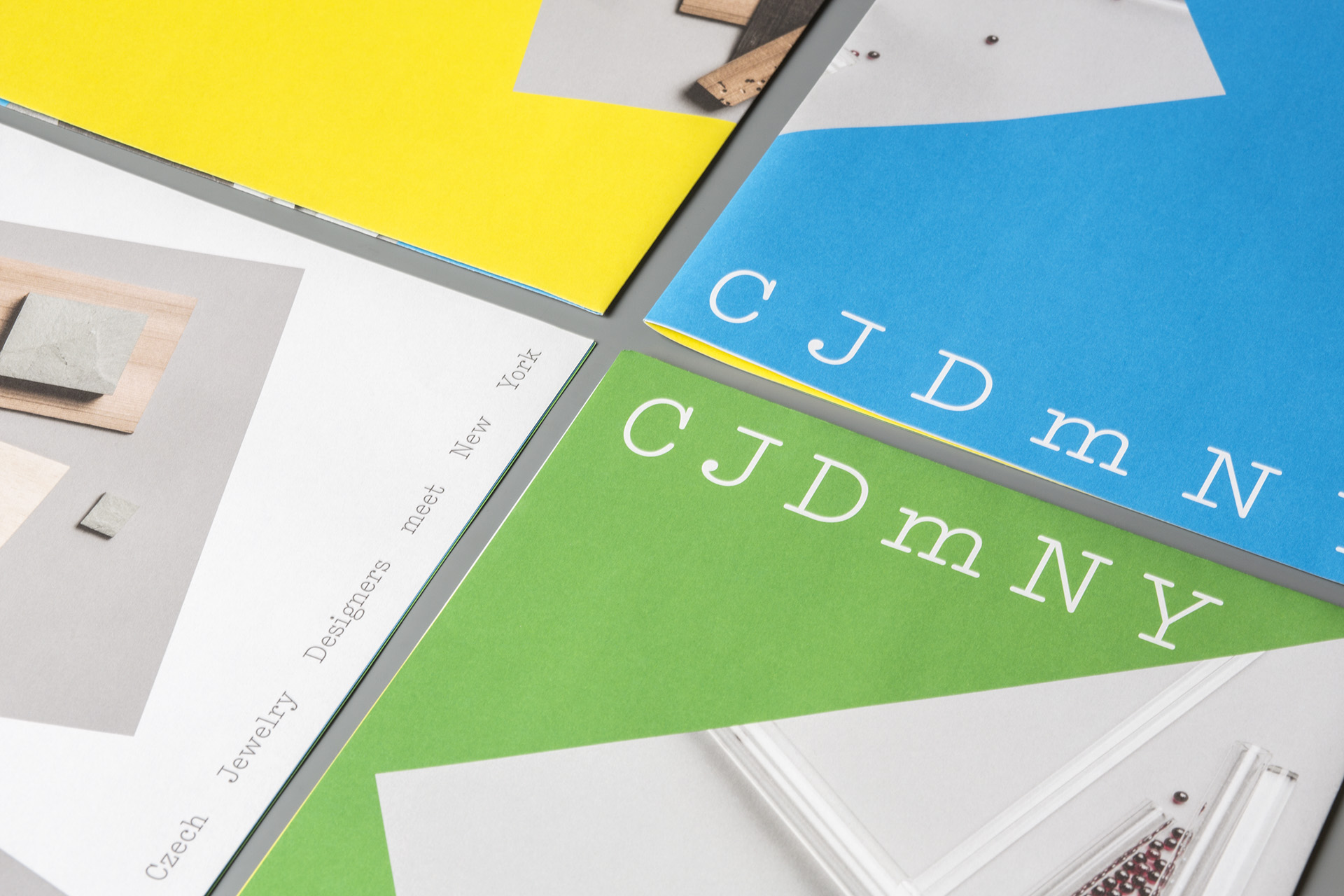
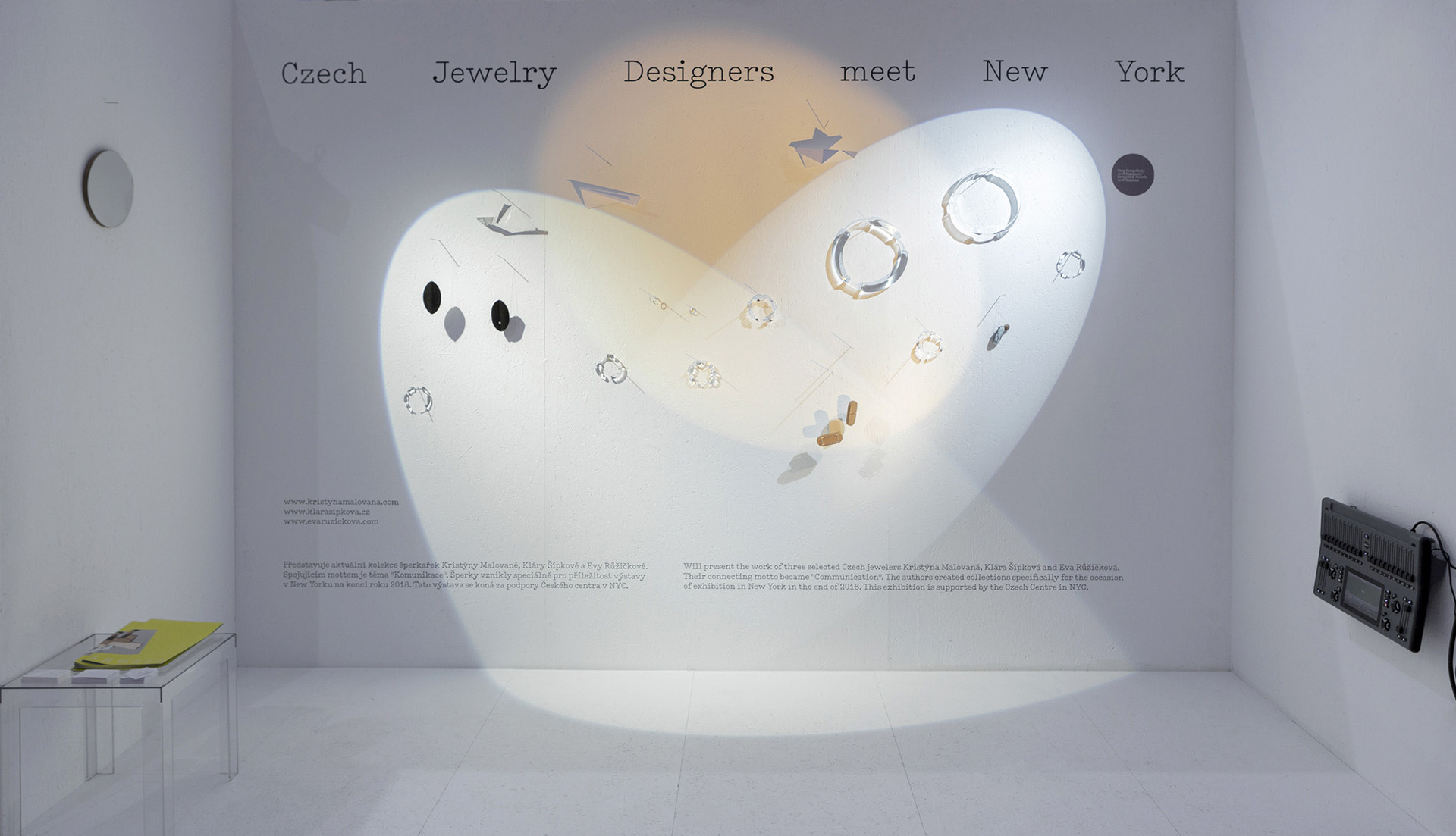
CJDmNY
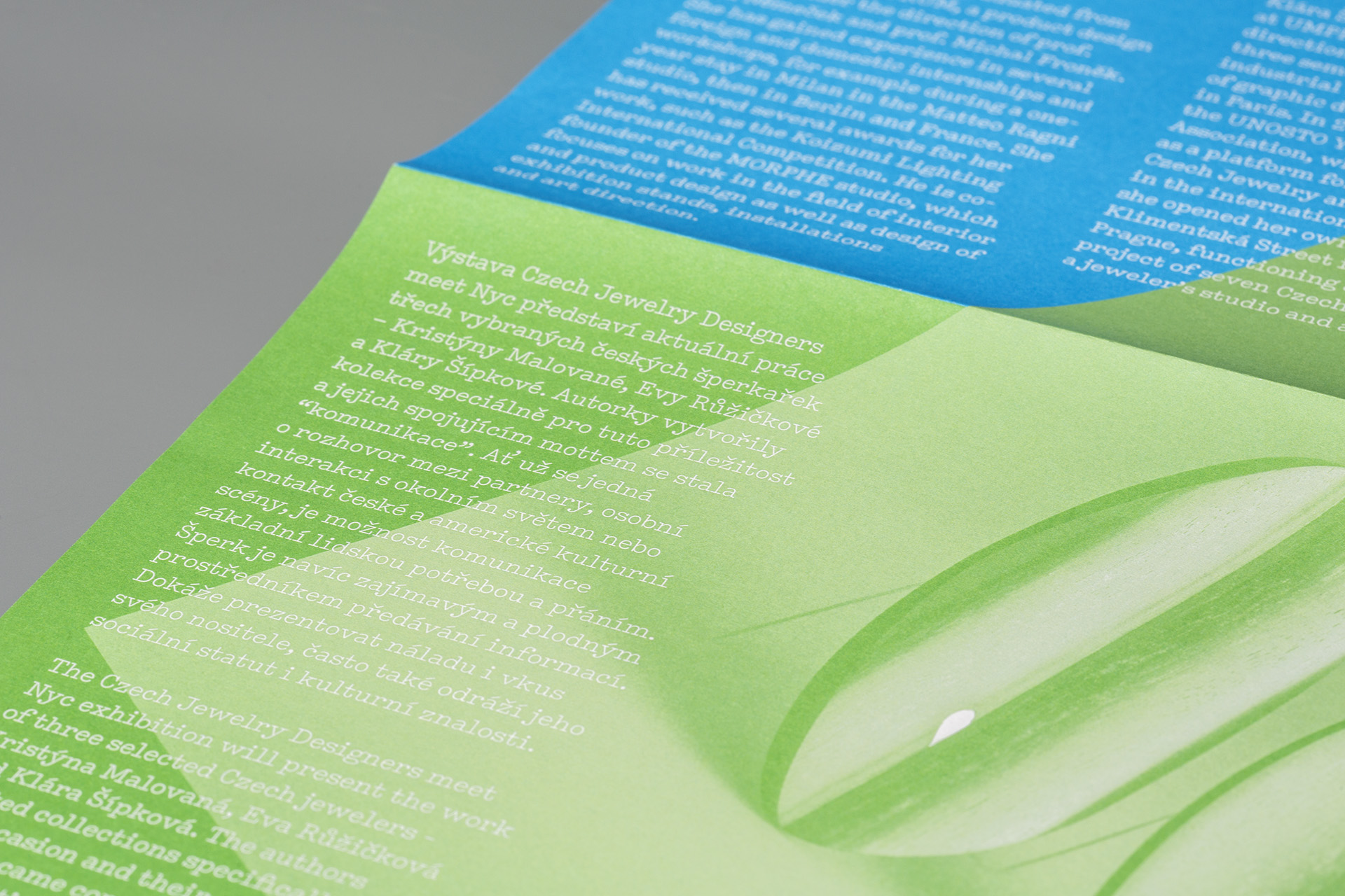
Czech Jewelry Designers meet New York. Three jewelry designers, three colors. Photos of the material structures they work with. And a poster as the main marketing material – randomly folded and randomly interpretable in color and content. Type as a paraphrase of the famous “I Love New York” logo, resulting in a modernized version of the American Typewriter font.
Even the use of graphic design at the exhibitions is simple – the colors breathe and the type is easily legible. One version works with three light points, the other, created especially for the New York exhibition, is interlaced with thin colorful lines.
cooperation:
exhibition architecture by Hippos design, Radim Babák and Ondřej Tobola.
tags:
catalogue, poster, exhibition identity
Links
MgA. Adam Uchytil
graphic design and visual communication
uchytil.adam@gmail.com
+420 776 288 754